POWER BI: Tables and Matrices
The Basics:
Just like in Excel, you can display data in a table or a matrix. A matrix is similar to a pivot table in excel. You can drag data fields into both rows or columns.
How to make:
-
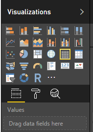
- Under visualizations, select table or matrix.
- Drag data fields into Values.
In format, under visualizations you can change the table style, grids, font size, etc to customize the table you created.

Power BI Table/Matrix with one Dimension:
Conditional Formating
To create a matrix or table with conditional formating:
-
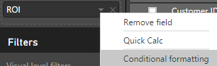
- Select value to format
- Select Conditional Formating
- Choose desired formating colors or range
Power BI Matrix with two dimensions:
This matrix allows for comparison of two categories at the same time. For example, we can quickly gain insight that Candy E in the New England region had the highest return on investment over the full date range. Similarly, it is quick to spot which combination of region and product is doing poorly. Using the date filter allows you to see how these values change over time.
Additional Comments:
See also: video on creating tables in power bi
Data Analyst
Tableau Consultant
Power BI
Data Analytics
Google Ads Data Analytics
SEO Data Consultant
email me at: arhoy@ualberta.ca